This guide is for beginners and walks through the basic steps of creating a design in the freeform version of ZOOMStudio, introducing you to the different tools at your disposal. You can find more in-depth articles on those tools within our help docs.
Prerequisites
-
You are already on the supplier's Studio.
-
You are already signed in
----
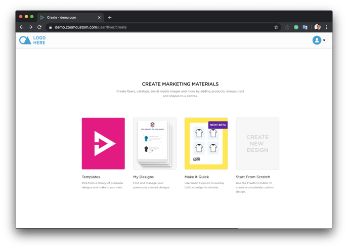
Studio Start Screen
Once you are signed in, you will see the Studio start screen. Here you have four options:
- Templates - A library of premade designs to help you get started.
-
My Designs - This is where you will find and manage your previously created designs (when you have some).
- Make It Quick - The Smart Layouts tool allows you to build designs quickly.
-
Create from scratch - Select this option to create a brand new design with the Freeform editor and create a completely custom design.
Start from scratch - Set up your design
Next, you will see the screen for setting up your design. Pay attention to this screen as some of the choices you make here can not be changed later.
-
Select your canvas size. This CANNOT be changed later. This is the size of your design. It most often depends on what you are creating. You can select from our predefined options, or in the sidebar - configure your own, including orientation.
-
Design Name. Name your design, often this can be the client you are creating it for or the project you are working on. The name will also be shown in the URL when you publish your design. This can be changed later.
-
Description. Add a description to your design and make it easier for you, or your team to find and understand the purpose of the design. This can be changed later.
-
Pages. Set the number of pages your design will be. This can be changed later.
Once you are happy with your settings, select the "Create" button to proceed.

Set up your Global Product Settings
Within Studio you are able to add products to your designs. Our global settings allow you to set up how those products will look by default. Meaning the setting you add here will be applied to every product you add to your design later.
You can choose to configure your global settings or skip them. BUT - skip with caution as you can NOT return and update your global settings.

As you can see in the above screenshot, in the left sidebar we have all the different product data items available to use. Using the checkboxes we can toggle what is and is not shown in our design - shown on the right side on our design canvas (basic shirt).
It's worth remembering that different Studio and different products can have slightly different data. For example, the shirt above has the gender option. Where a tumbler or any other gender-neutral product would not need this option.
In this tutorial, we are not going to cover styling your products, but here you can go through each item and style as you like. Including the product layout, the different fonts and sizes you want to use, how you want to display pricing and more.
You can change these options on an individual product basis later.
When you are happy with how your products will look by default, click continue.
Next - The Studio Editing Interface
Great! You've set up your design and we're now within the Studio Editing interface, where you will create your design. Before we start adding things to the canvas, let's take a look at the interface itself.

Add a product to your canvas
Using the toolbar, select the "Find Products" option. This will open a panel where you can search and filter for the product you want to add to your canvas. Once you have found the product you want, use the "Add" button - this will "add" it to your canvas.

You should now see a product on your canvas! Great work! With the product selected on the canvas, you will see the layers pane (right sidebar) has changed. It is now showing the product details for the selected Product.

Here you can make changes to the product, including toggling what details are and are not visible, updating the layout of the product, adjusting font sizes, configuring how you'd like to display pricing, and more.
It's worth remembering that different Studio and different products can have slightly different data. For example, the shirt above has the gender option. Where a tumbler or any other gender-neutral product would not need this option.
In this tutorial, we are not going to cover styling your products, but give it a try yourself! Click the arrow to the right of the product detain name and expand the available options, then change font sizes, colors, and more.

Adding an image to our canvas
Great progress! We have added a product to our design - next, let's improve our design by adding an image. Go back to the toolbar and select the "Images" option.
Here you can upload an image from your computer, select from images you previously uploaded, or select from existing image libraries such as the ZOOMcatalog Lifestyle Images library.
Once you have selected the image to add to your design, you drag the image around until you find the best position, and just like the product we added before - images come with a number of options to help you create the best possible design.

Adding a background
Just like images can help bring your design to life, backgrounds can take your design up a notch. Backgrounds are different from images because they apply to your canvas. You can change the background colour, or even add a background image. Go back to the toolbar and select the "Backgrounds" option.
In the left pane, select a colour - create your own or you can upload a background image or select from your previously uploaded.
In the layer pane, just like we've seen with products and images - you have a collection of images to apply your background perfectly.

Add some text
We're making some great progress. To finish our design off, we want to add some text and a shape. Let's start with the text. Going back to our toolbar once more and selecting the "Text" option.
In the left pane, you will see a list of different fonts available for you to use. Select the font you want to use using the "Add" button.
In the layers pane (right sidebar) you can edit the text and style it as you need. You can also drag the text around the canvas and position it as you like.

Add a Shape
We're nearly done with our design! One last final touch, let's add a shape. For one final time, let's go back to our toolbar and select the "Shapes" option.
You can then see a library of different shapes available for you to use. Select the shape you want to use, and use the "Add" button.
With the shape selected, you can see the available options in the layer pane (right sidebar) to edit the style of the shape.
